Bouncing Ball Exercise
During this exercise, the main tools we used were the brushes and the shape tools.
As we were going for a watercolour style, the main two brushes we used in particular were the 'Kyle's Ultimate Pastel Palooza' which was used to draw in the colours, and 'Kyle's Paintbox - Wet Blender 50' which, as the name suggests, was used to blend the colours together.
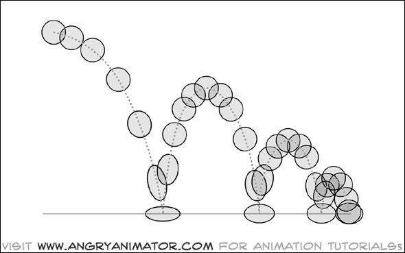
Within our documents, we used this guide by Angry Animator to guide where we moved the ball. The timeline was an integral feature in doing this.
After the ball was animated, the background was done next. This involved us using the fill tools to create two sections, one being for the ground and the other for the sky. We then populated it with different shades using the same two brushes as earlier. For my animation, I went with something semi-realistic, in this case a skyline. Since purple is my favourite colour, that's what I decided to use for everything else.

Walk Cycle
Compared to the bouncing ball exercise, this was a lot more complex, as animating a figure requires a lot more different moving parts compared to a single ball. Also unlike the previous activity, instead of making the subject move through a scene, we instead moved a scene around the subject, which presented its own unique challenges.
Because of how many moving parts this exercise required compared to the last, there was an extensive of amount of organisation that had to be done, such as making separate groups for the limbs and the main body and copying them when whenever we needed to make a new frame. We also had to use quite a few more features.
Out of all the tools we used, the most notable one was the puppet warp tool, which allowed us to give the figure joints that we could manipulate. This tool, while very useful, did come with its own issues though, as sometimes the results of moving things around with it could sometimes warp the figure in weird ways. When this happened though, I would usually just re-draw the areas that looked slightly janky, and that would work well enough.
To match the style of the character, I made the background equally as abstract. I made it in a vaporwave style, which typically features wide landscapes, usually consisting of angular shapes and glowing grids and a big sun in the background.
I initially created both the mountains and the grid on the same layer so I could have them all move together, but I later separated them, and pushed the mountains further back into the scene to give it more depth.
The main challenge was making making the grid move, as it was it was the main source of perspective in the piece, and it had to shift in a way that would keep this perspective consistent. I also put a lot of effort into making the beginning and end frames in matching positions to create a seamless loop.
The general look, I had in mind very early on. Deciding on the colours on the other hand was a little more difficult. In the beginning, I went with magenta as my primary colour, and this is what it ended up looking like:

After making the scene in that colour though, I found that it looked way too monochrome and not as interesting as it could be. After going back and playing with the colour hues to see how they looked, I couldn't really find anything that I liked except for making the sky more orange, and the ground more reddish.
I also realised that the shade of red I used for the figure was too desaturated compared to the background, so I adjusted it to be more vibrant.
There was a few other adjustments I made to the piece too, such as the addition of shading to the mountains in the background and a colour gradient to the ground, all of which I think improved the piece greatly.
Final Result

As a whole, I really like how my piece turned out. I feel like going with a bit of an abstract style was a good direction to go in and made for an interesting-looking end result.
Self Directed Project: Walking in Dreamland
After a little bit of searching online for animation guides, I decided that for this task, I wanted to make my character to be doing something that wasn't simply walking.
My initial idea was to go with something like ice skating or rollerblading. At first I tried looking for animation guides like we had got for the walk cycle, but was unsuccessful. Instead I tried looking for real life references instead.
Eventually I decided to switch my focus to skateboarding, as I just wasn't finding the reference footage I wanted.
I wanted to find a reference that had a bit more of a chilled out tempo to it, with maybe only like a couple of pushes. However, because of how specific that was, it took quite a while to find a reference that fitted my criteria.
I did eventually find something that fit that description pretty well. Only problem though was that it only showed the legs of the person and nothing above their waist, which was a little disappointing. I did end up using it though, as it was pretty much the best thing I could find at that point.
I did eventually find something that fit that description pretty well. Only problem though was that it only showed the legs of the person and nothing above their waist, which was a little disappointing. I did end up using it though, as it was pretty much the best thing I could find at that point.
Since I wanted to make my own design later, I chose to create a skeleton of a figure instead of a fully completed one. While this seemed like a good idea, it probably made the process a bit longer than it needed to be.
Due to the footage I was rotoscoping only featuring the bottom half, doing the top half required a separate reference to be used. This further increased the time it took to animate. In the end though it did look quite smooth.

There were a couple of issues I encountered when adding the figure onto the skeleton that made it take a little longer to animate.
- The foot that was supposed to be in contact with the board was sliding back and forth.
- I did not consider the fact that the figure would be on an elevated surface (in this case the skateboard) when animating the skeleton, which resulted in the foot that was supposed to be pushing the board along was not actually making contact with the ground. I did not realize the error for a while, so once the issue was spotted, I had to go back quite a few frames to correct the movements.
For the background, I wanted to follow the path I had started with the walking cycle animation, and make an abstract-looking background. As the title of the exercise was "Walking in Dreamland", I used the freedom it gave me to create a more abstract environment.
Instead of using a grid pattern like in the previous exercise, I used white streaks on the ground as well as some floating objects above.
Instead of using a grid pattern like in the previous exercise, I used white streaks on the ground as well as some floating objects above.
I was going to add more objects into the environment. However, since trying to make it loop was proving more difficult and complicated than I anticipated, I couldn't add anything else.

Overall, I was happy with the animation. It did take a lot of time to get done though, which was made worse by the fact that I gave myself more animating to do by starting with a skeleton first rather than going with the full figure straight away. However, I think this made the result much better/more realistic.
If I had the time, I would have made the scene more populated and added more objects floating above the character. These could have been of varying sizes and distances away from the character, which could have created a better sense of perspective.
I also would have overlaid some rough shading over the character to incorporate them more into the scene.
Comments
Post a Comment