Learning InDesign
Session 1
Before going into InDesign, we were taken into photoshop fairly briefly, to learn a bit about how to change jpeg/png images into bitmap images using the "mode" menu.
Considering I had used Photoshop for so long, I was surprised to see that you could do a lot with the "mode" tab, something I had never really played with before.
This session is where we learned a bulk of the information needed to operate the program.
There was quite a few things it had in common with photoshop and illustrator, so it wasn't too unfamiliar, What I immediately noticed was that there was quite a few more settings and options required when setting up a document, such as the ability to choose the amount of columns you wanted, and other obscure settings.
There was also a wide selection of different templates, from paper sizes to screen sizes of different devices. However, for the purposes of the session, we just went with A4.
For the duration of this session, we were walked through a lot of the most essential features such as shape and text tools, as well as how we could combine them to create different layouts. We also focused a lot on how adding images worked, which was quite a lot different to how it worked in other apps.
Some of the exercises we went through are shown below.
 |
| Laying out a page using grids. |
 |
Overlaying the same few shapes in different ways
|
 |
| Creating text and implementing images within it |
 |
| Wrapping text around shapes and wrapping text around images |
|
 |
| Changing the properties of images and image colours, putting pictures into custom shaped frames |
Session 2
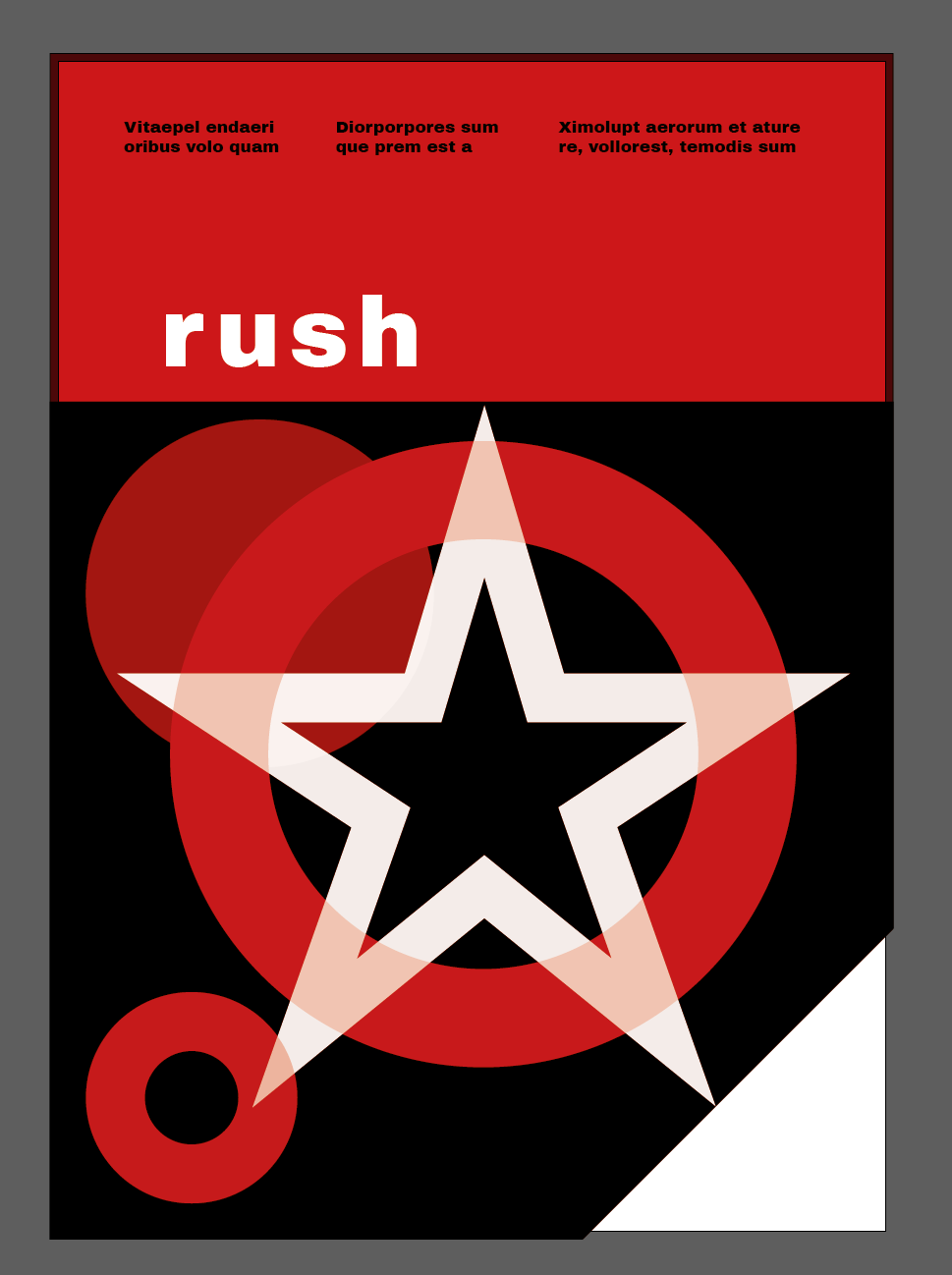
There were two distinct parts of today's session, the first one was creating album covers, and the second was setting up an interactive portfolio.
Creating the album covers was pretty similar to how it would've been in illustrator, so the tools used to make them weren't too difficult to use. However this time I did have the columns to consider, and I often had to make sure that the different elements were in-line with them.
I'd say the real difficulty was with creating ideas, as I was initially pretty slow to think of things to make. Below are some of the covers I was able to create:
Even though we were already creating a Wordpress site/blog with Mike, this was something a bit different. This was because we were pretty much creating everything from scratch. It was also specifically stated by the tutor that the aim of this was more too practice designing rather than focusing on writing lots of text.
Session 3
This session was a lot less intense compared to the two previous sessions, which were a lot more intense due to us needing to learn so many things.
This time though, we were basically continuing what we had started yesterday, and there wasn't really much more things to needed to learn about to get on with our work. The only big thing we really learnt about was the interactivity features. From what I could see, there was a lot of options for things we could do, such as adding sounds and animating different elements akin to a Microsoft Powerpoint presentation.
For today though, we only really went through the buttons feature, which allowed us to assign certain functions to different elements, which upon clicking, would do whatever function we gave to them. We also learnt about embedding videos using html code, which is basically the code that in-design operates off of.
I was very happy with what I was able to do with these buttons. We were walked through how to create forward and back buttons that we could use to cycle between pages. After that was done though, I added some extra little things such as a home icon that would take you back to the first page. I also added the ability for the buttons on the homepage to take me to the different sections directly, which felt very good and satisfying when I got them to work.


Comments
Post a Comment