Logo Recreations
For this task, the logos we re-created were the Google and Nike logos.
For the google one, we were directly walked through the process, so it wasn't that hard to follow along.
The Nike one was a little harder though, as I found the text pretty difficult to re-create. Unfortunately, after I finished I noticed there was a couple of errors, but by that point it wasn't really worth coming back to, as these errors were pretty minor.
Album Cover
When we were given the title of "Future Alignments", my mind immediately went to thinking of bold angular text, and the idea that everything in my design would align with each other in some way.
To decide which artist I was going to base my album cover on, I took a look through at my faved artists list to find which one I'd pick. At first, I looked at rock bands like Biffy Clyro and Coldplay, but after deciding that the style I was thinking of wouldn't really mesh with their other Album Covers, I began looking at electronic artists instead.
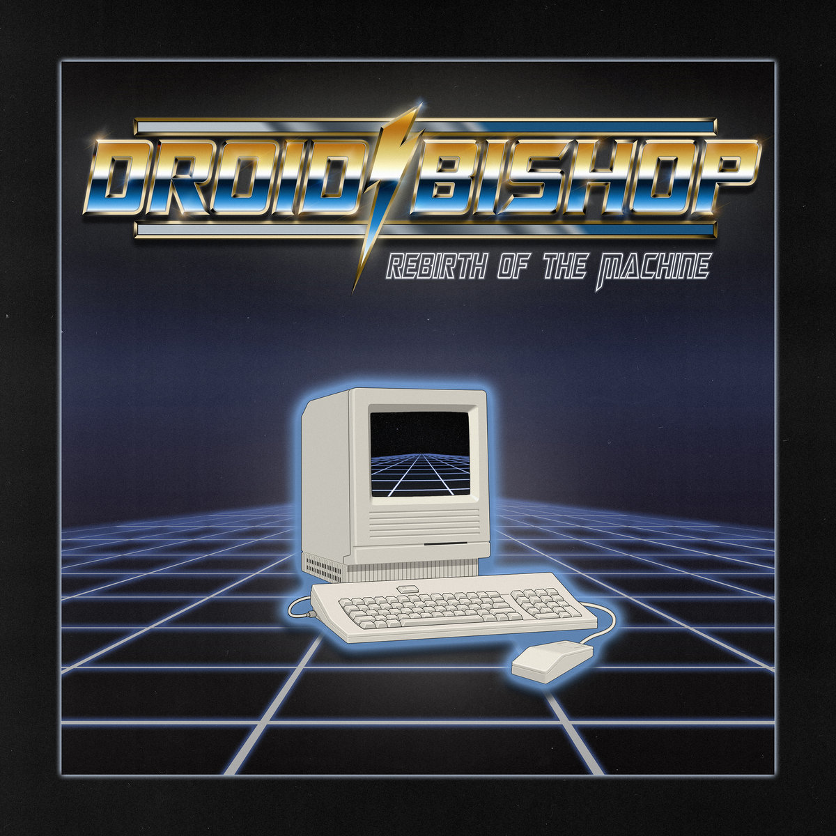
Some of the electronic artists I considered making an album cover on include Scandroid and Prototyperaptor. However I didn't go for them due to the fact that their album covers didn't really match the idea I had in mind. Eventually I settled on Droid Bishop, as they suited my idea the best.
I decided to make grids the primary visual in my piece, which was a decision influenced by Droid Bishop's synthwave theme. I also saw them using grids in a few of their album covers, particularly this one:
It took me a while to figure out how to draw grids in the program. I initially started by trying to construct them out of lines and rectangles, however this didn't really look that nice. After doing some searching online, I eventually found that there was a grid tool already in illustrator that I could use. This made my process a lot easier once I had found this out.
Out of the few rules they gave us for this task, the one where we could have a maximum of two colours probably gave me the most difficulty, as that automatically limited what I could do. I didn't want it to look bland, so I thought that adding a colour gradient from purple to black was my way of making it more interesting.
This is what my piece looked like by the time the uni day had ended:

Half way through the process I had to change the white grids to purple, as I realised that I currently had more than 2 colours in my composition.
I wasn't originally planning to include the name of the music artist, but I eventually did so because the bottom of the piece looked a bit featureless and empty. I could have added some random shapes instead, but I decided to include the logo of the music artist, as it allowed me to test some other features that I wouldn't have used otherwise. (such as "make and expand)
This was the final version of my album cover:

And this is the alternate colour scheme:

I considered replacing the black with white, but when I tested it on the background I decided not to go ahead with it, as I didn't really like how it looked. This is what it looked like:

Comments
Post a Comment