The section of the tutorial we focused on today was “Visual Styling - User Interface - Head-Up Display”.
This required us to make a User Interface (UI) for our game. To achieve this we used a feature in Unity called Canvas. This creates an overlay which is displayed on top of the cameras and hovers above the game view. We used it to make a health bar that would show when the character gets damaged or healed.
This was a complicated process that required us to use many features.
This included making a mask for our health bar. The aim was to make the parts of the health bar that do not overlap the mask become hidden when you reduce the length of the masking box. This would allow the health bar to properly shorten when the character gets damaged and get longer again when they receive health.
To make this work, we made use of the feature called anchors, which were arrows that you could move to different parts of the image and use to define the size and position of the images. For a majority of this exercise, we used a Pivot menu which provided a variety of presets for the placements of these anchors.
We had to make a new script for the health bar to make sure that the main character and the health bar communicated with each other and make sure the health bar getting larger or smaller would respond to the character taking damage. This required some changes to the coding of our main character, and a new script, which we added to make sure the health bar operated correctly.
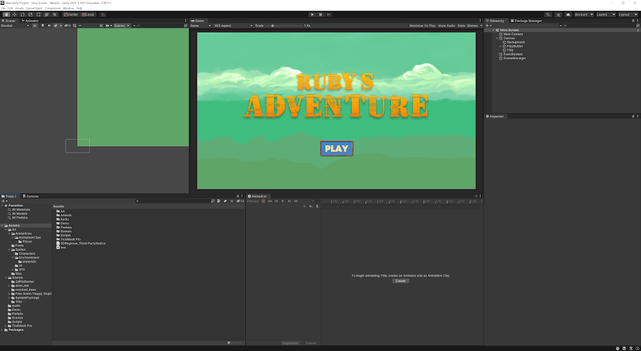
We didn't have a logo supplied to us in the package files we were given at the beginning of the tutorial, so we had to make our own. I decided to make mine in Photoshop. Because the game we made had a steampunk theme, I looked for steampunk styled fonts on Fontspace and Dafonts. I eventually found a really good font called “geosteam” from Fontspace.
To get it into my photoshop document, I had to copy and paste the font preview from the website. Because everything in steampunk is mainly metallic, I wanted to make the text look as though it was made of gold or copper. I tried to achieve this by using the gradient tool with shades of yellow and orange. I then added a bevel effect to make the text look more 3 dimensional, as well as a drop shadow, to make it look as if it was elevated off the page. I then moved it into the source files of my Unity project so that I could insert it into the scene.
 |
| The logo I produced |
 |
| My logo implemented into the title screen |

Comments
Post a Comment